As noted in my last post I was ratching through the Ralph Gibson website yesterday evening. It so happens that I have a copy of World Photography – Ed: Bryn Campbell that also has some good quality reproductions of several Gibson prints (book review later). Several of the shots reminded me of photos I’ve taken in the past but left in colour – largely because until recently I’d had no interest in black and white reproduction – so I though it might be instructive to choose a couple – convert them to high contrast black and white and see which I preferred and what, if any changes in impact I could identify.
First up is a sandstone buttress on a local church with a blue sky behind – brought to mind by this shot of Gibson’s. In the book the stone blocks print rather brighter than the reproduction on his website so the suggestion of ‘heat’ is more noticeable. The thing that strikes me most about this particular image is that despite the simplicity I have spent significant time just looking at the fine grain in the blocks and wondering about the purpose of the building. It comes from a set called Quadrants which is loosely based, as far as I can tell, on photos containing squares or implied squares.
The image it reminded me of, and the black and white conversion are here. To get from one to the other I used the fairly obvious expedient of reducing luminosity in the blue and aqua channels and increasing it in the red, orange and yellow channels in lightroom and then adjusting overall exposure contrast black point etc.


The colour version feels unmistakeably British. The stone is a mellow red-orange, the blue is a nice saturated contrast, there’s no obvious glare – to me at any rate it reeks of temperate climate and summer. The b&w version, on the other hand, feels like hot climate, unremitting heat, glare and so on – so there is a quite different feel as a result of the conversion. The first version relies purely on hue for its effect as the saturation and luminosity are about the same (easily confirmed by temporarily converting to grey scale in PSE and measuring the density) – the second relies purely on luminosity. If it isn’t a strange distinction to make I would say that the colour version is more pleasing – but the b&w version is more interesting – in part because the surface textures are enhanced and, if you know what you’re looking for, it highlights the different stone dressing techniques that were employed.
There is the hint of an eye in the top right – I suspect the edge of an abutting roof or gutter – I may have to make a return trip in the summer to see if it’s practical to emphasise that aspect.
The next image I was reminded of by these two: Black Series and Deja Vu. The first of these set me trawling through all the window frames and door decorations that I had photographed when I made my book on Maryport, the second focussed my search to this one, which is nothing if not drab:

I had to work a bit harder to extract the image I was after from this one, but in the process I got a surprise result – it’s quite dramatic in minimal colour as well as b&w.To get the colour version I had to massively increase contrast in curves, push the black slider to 100% and increase exposure by 2.5 stops, it was then simply a case of Lightroom’s default conversion to get the b&w version.
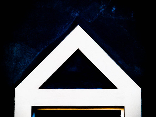
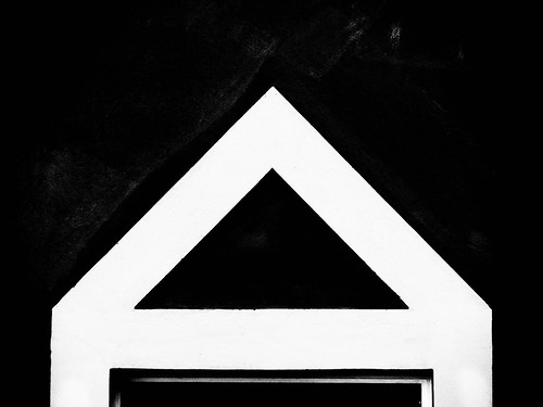
The original, as noted above is just dull – I doubt it’s interesting enough to be worthy of a second glance. There’s not enough in it to give any real clue as to what it is, and little to attract the eye. I think the full b&w suffers a little from the same problem, although there are hints of detail in the black to suggest painting and hints of a 3-D structure at the base.
For me the minimal colour version is a significant improvement on both with hints of the colour field work of Rothko or Newman. Compared with the Gibson Deja Vu it clearly lacks the hint of narrative provided by the human presence, but is still intriguing enough to stand on its own.
I think where this is getting to is that it is not the large areas of dark or light that interest me in Gibson’s work, but the way in which his approach concentrate the eye on the detail. This would fit with some of the ‘profiling’ I’ve done at work, where it’s my interest in detail (although not my attention to it) and my ability to find patterns and connections that crops up regularly.
So for me the answer to my opening question is whichever provides me with the info I need to engage with the photo. In the first case, I’m more engaged with the b&w version – in the second the minimal colour. Nothing terribly insightful there I guess except that I’m becoming more and more interested in the potential of B&W to isolate patterns and detail.
Not sure how I weave any of this into the remaining assignments though :0(
No comments:
Post a Comment